DÖNER DÜRÜM · HOMEGROWN SHAWARMA · BRANDING · PACKAGING
Packaging & Brand Refresh
A local favourite with a logo people already loved. My job was to make everything around it look as good as the food tastes.
- MY ROLE
- Brand and packaging designer
- WHAT I OWNED
- Brand refresh, pattern, packaging, menu and signage
- TOOLS
- Figma, Illustrator, Photoshop
- INDUSTRY
- Food and beverage
01 THE PROBLEM
The brief: strengthen the brand without losing what made it theirs. The logo stayed exactly as it was. Everything around it had room to grow.
02 THE PLAY
Three bits of psychologybehind the takeaway bag.
- 01
Keep what people trust
A familiar mark is a shortcut to trust. Changing a loved logo resets that, so it stayed put and the brand grew around it.
- 02
Let the pattern do the talking
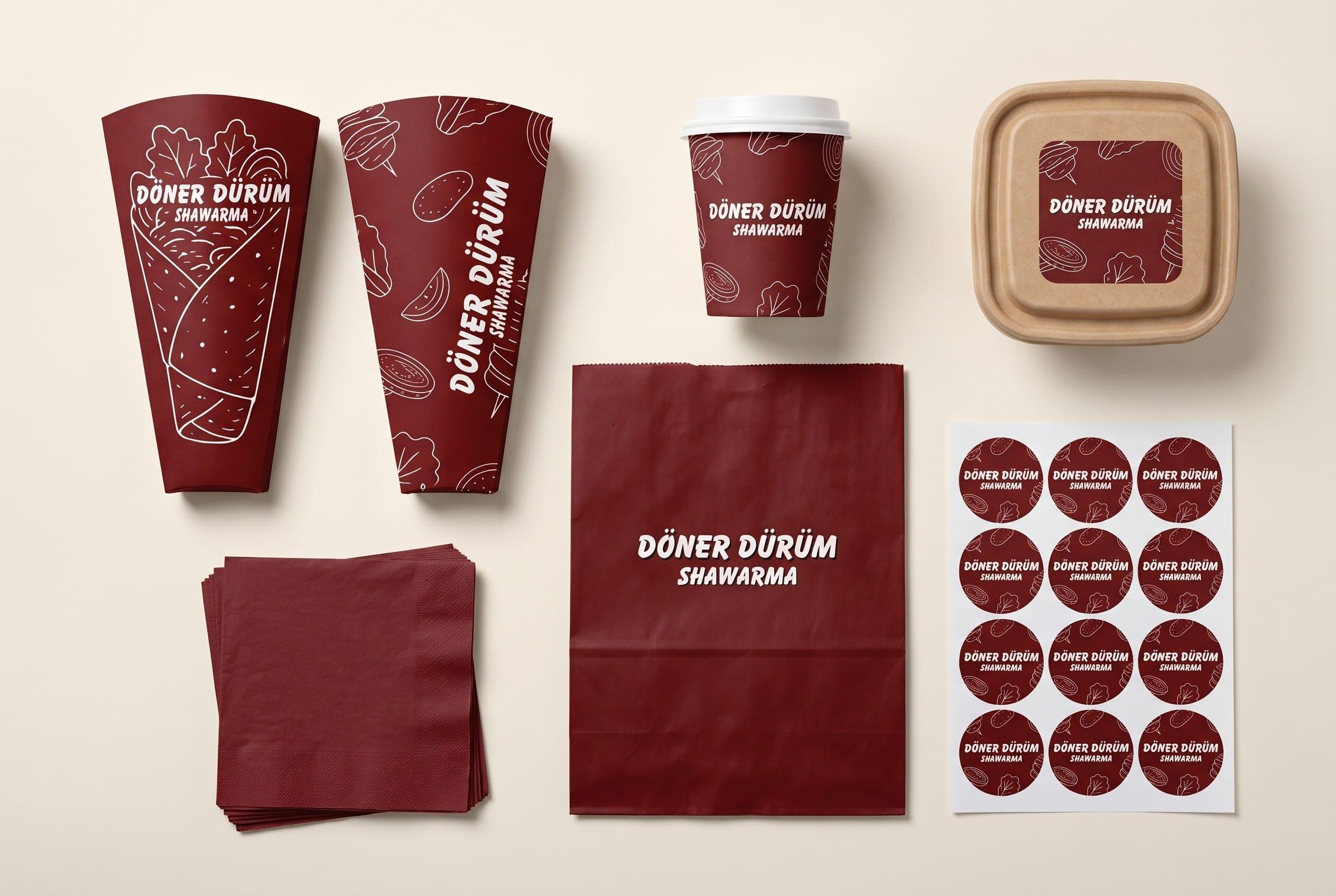
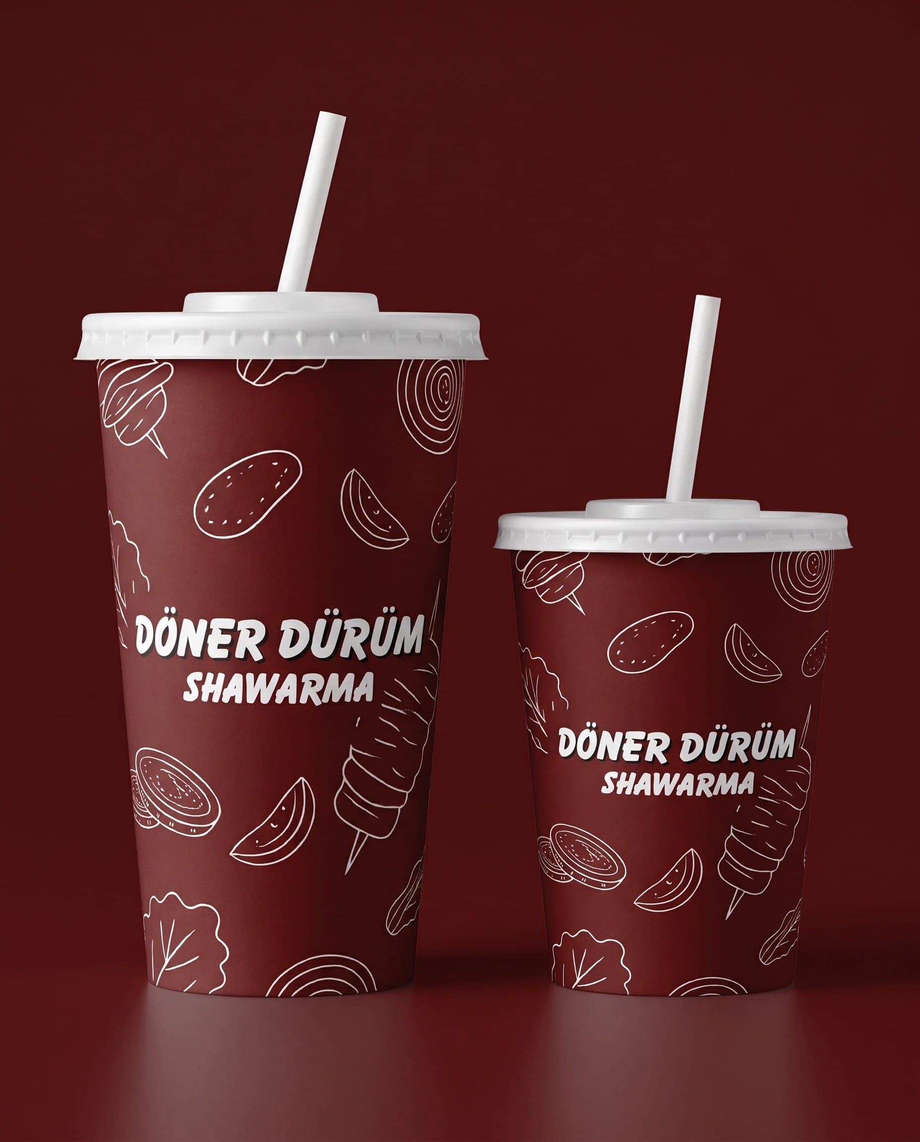
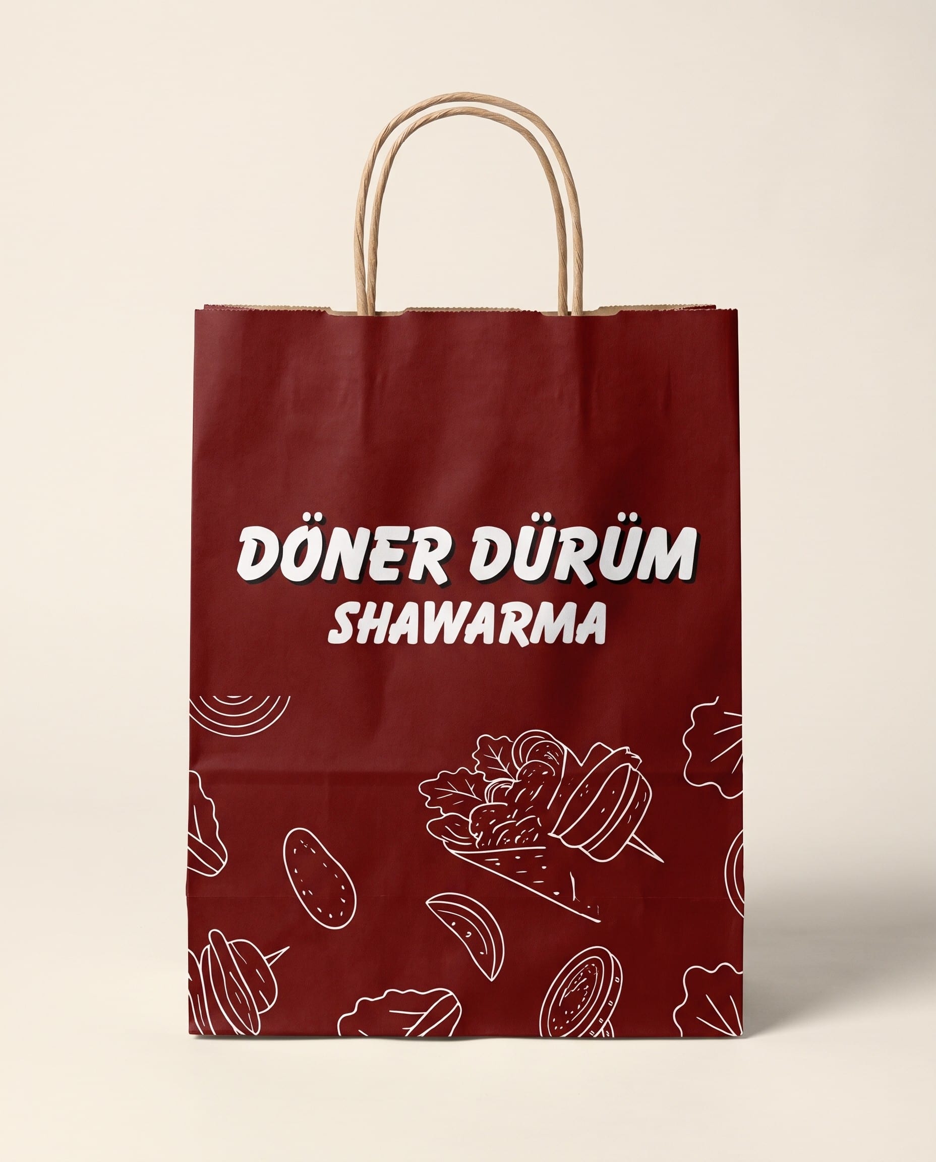
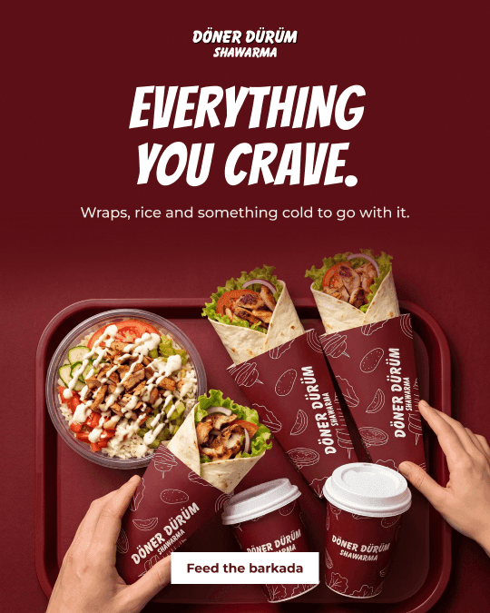
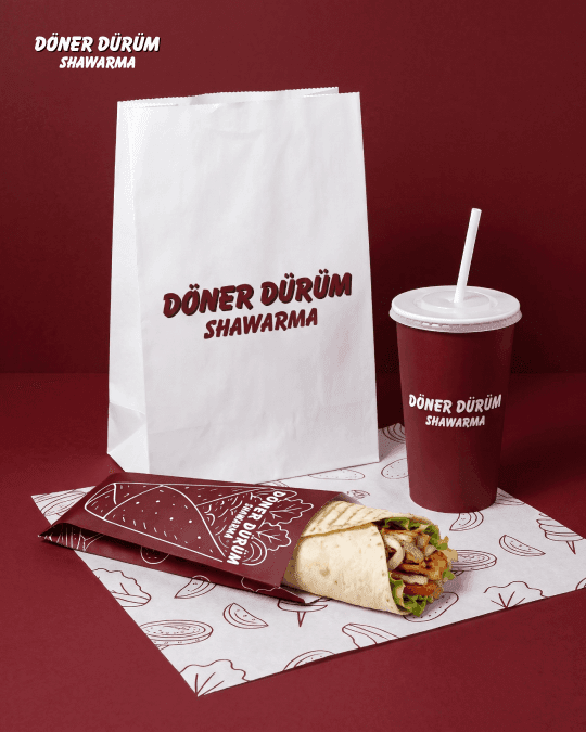
A Turkish-inspired pattern turns every cup, bag and sleeve into a tiny billboard that walks out of the shop.
- 03
People eat with their eyes
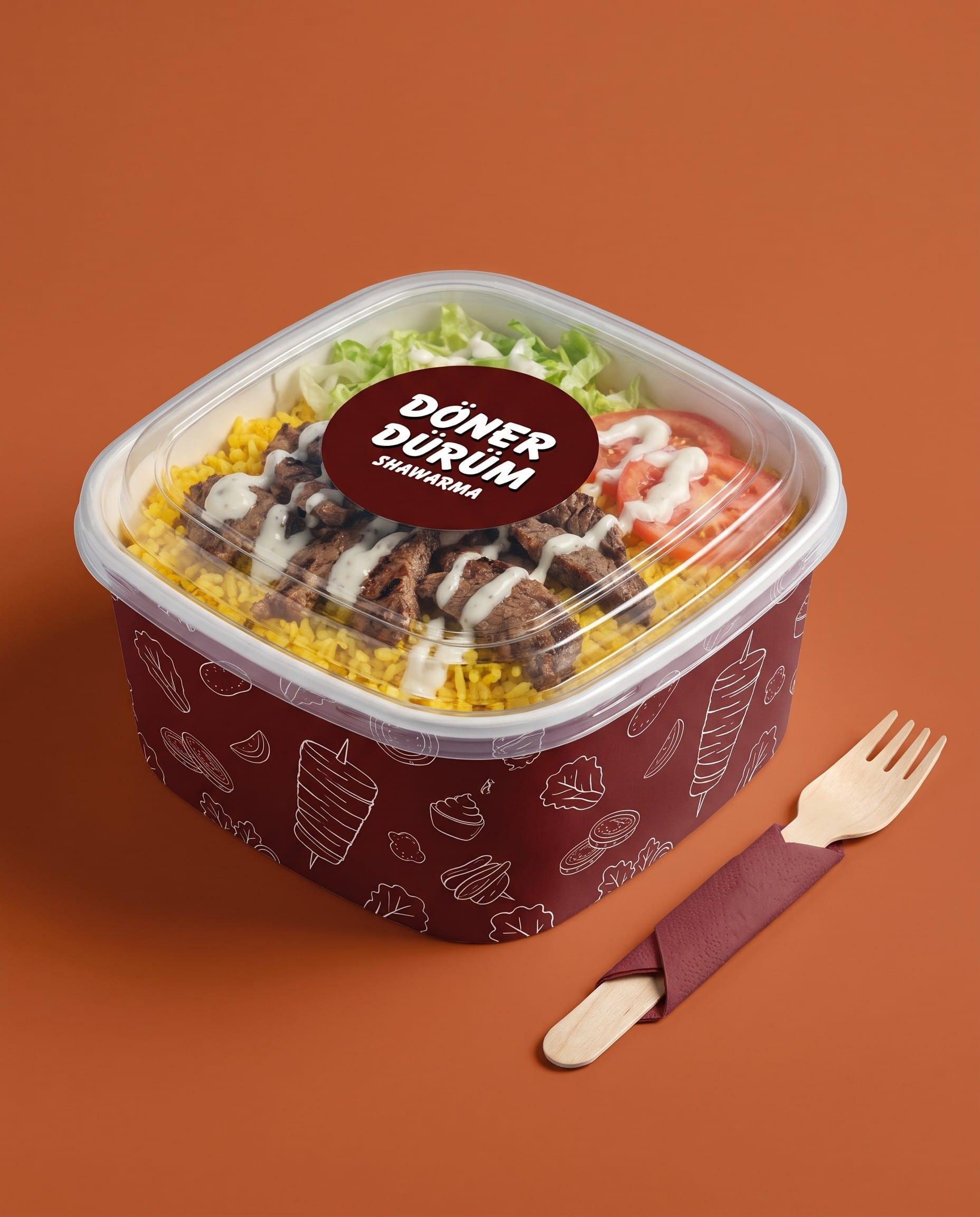
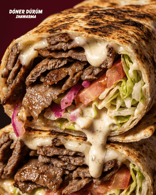
Rich colour and bold pattern make the takeaway set look worth photographing, which is free marketing for a local spot.
03 THE BRAND BOARD
The whole systemon one board.
Logo, colour, type, pattern and the pieces they live on. Scroll inside the board to see everything.
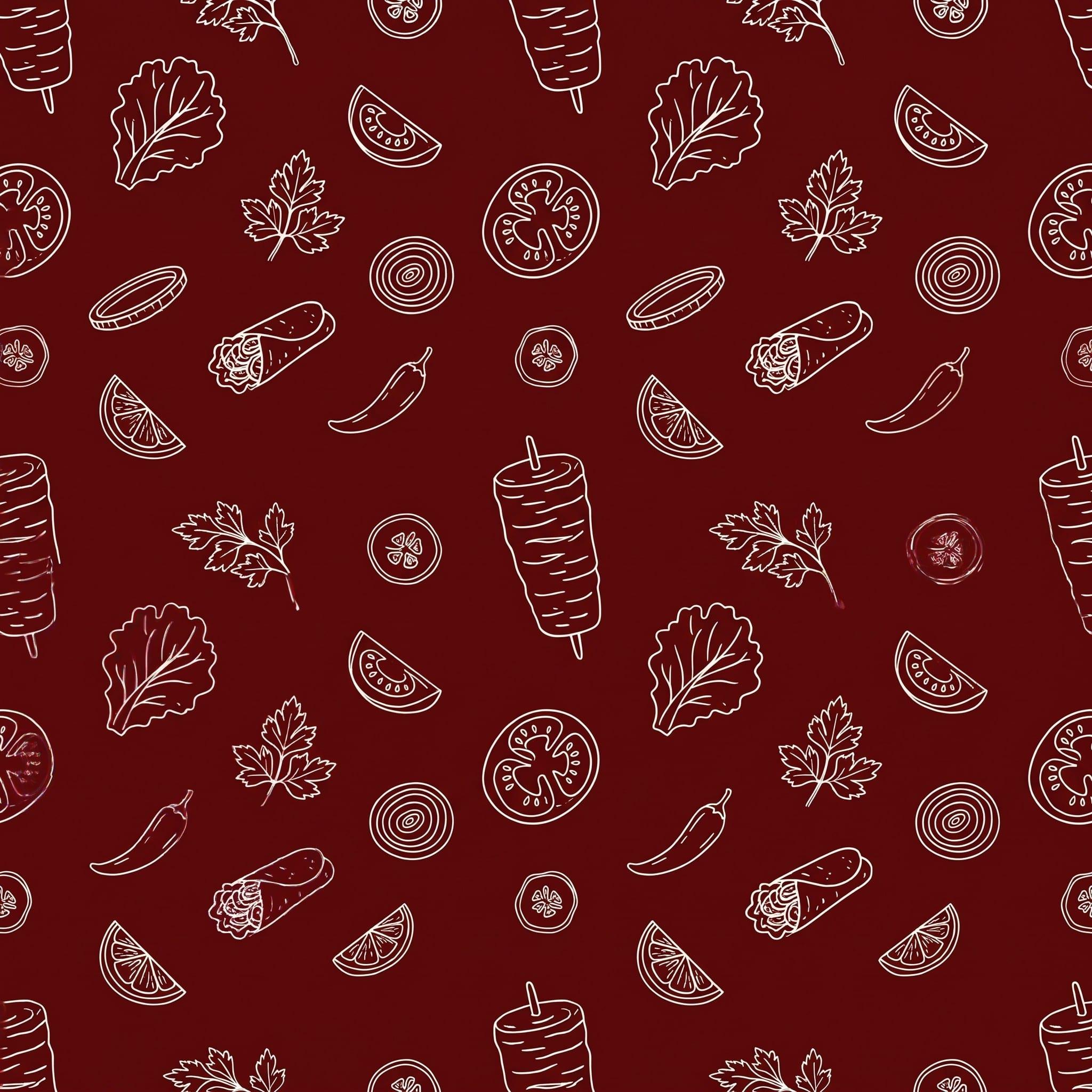
Brand pattern
The Option 1 line art, extended into a repeat for bags, cups, liners and posts.


Logo · unchanged
The wordmark stays exactly as the client had it. Everything around it is what changed.
The brief
A homegrown, Turkish-inspired shawarma brand wanted to look stronger without becoming someone else. The logo and the offer were not up for change.
My role
Brand strengthening: colour and type system, ingredient pattern, packaging design, menu and brand guide.
The idea
Keep the core, sharpen the edges. One maroon, two typefaces and one hand-drawn pattern, applied everywhere a customer touches the brand.
What stayed
The name.
The logo.
The red.
The offer.
What got stronger
Colour discipline.
Type with jobs.
A pattern of its own.
Packaging and menu.
Guide v1 → v2
→
Black-to-red gradient
Deep Maroon #5A1310
The gradient was retired for one flat maroon, so wrappers, tarpaulins and screens can all carry the same colour.
Deep Maroon
#5A1310
Packaging and print
CMYK 0 · 79 · 82 · 65
One maroon.
No gradients.
Brand Red
#C70000
Accent
Burnt Orange
#C75B2A
Highlights
and sale tags
Black
#000000
Social
backgrounds
Pure White
#FFFFFF
Logo
and type
Typography
Aa
HOT OFF THE SPIT.
Balloon Extra Bold
Brand name, product names, headlines, promos, signage
Montserrat
Prices, descriptions, captions, social copy
brand identity
04
Döner Dürüm
A homegrown, Turkish-inspired shawarma brand in Laguna that needed to look stronger without giving up the logo and the offer it was built on.


Primary · packaging and print


Light contexts · print only


Social and screens
Shadow rule
A hard 2px black offset. Never blurred, never glowing.

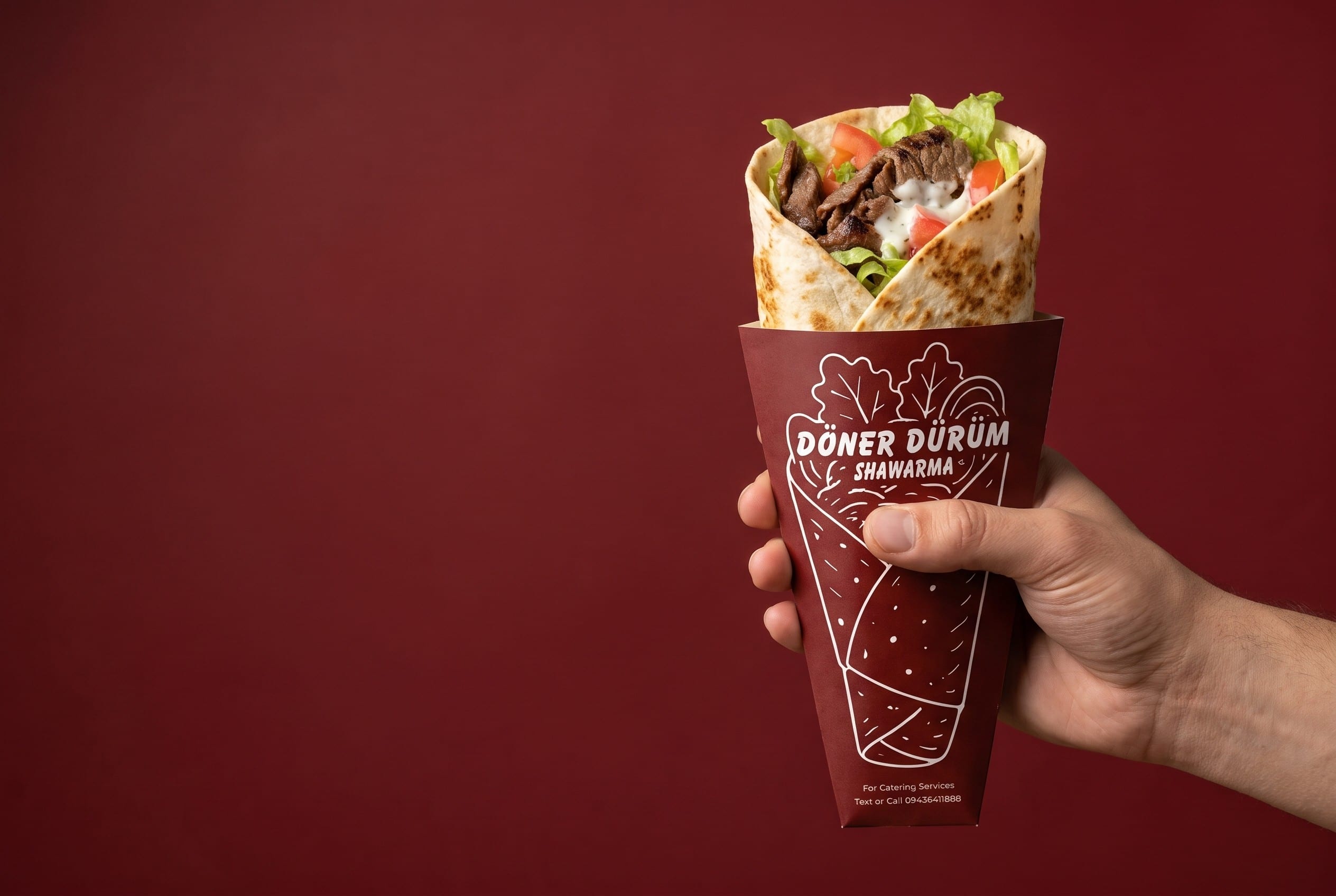
Wrap sleeve · Option 1
Packaging · Option 1
THE WRAP IS THE HERO.
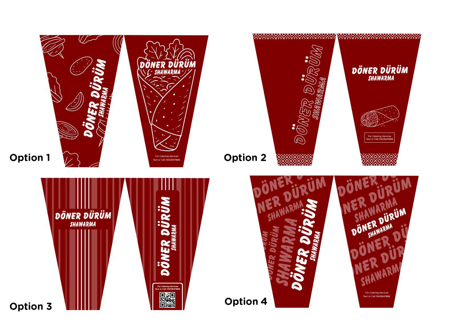
Four routes explored
Illustration, Turkish border, stripes and repeat wordmark. Option 1 went forward: hand-drawn line art of the wrap and its ingredients on flat maroon.
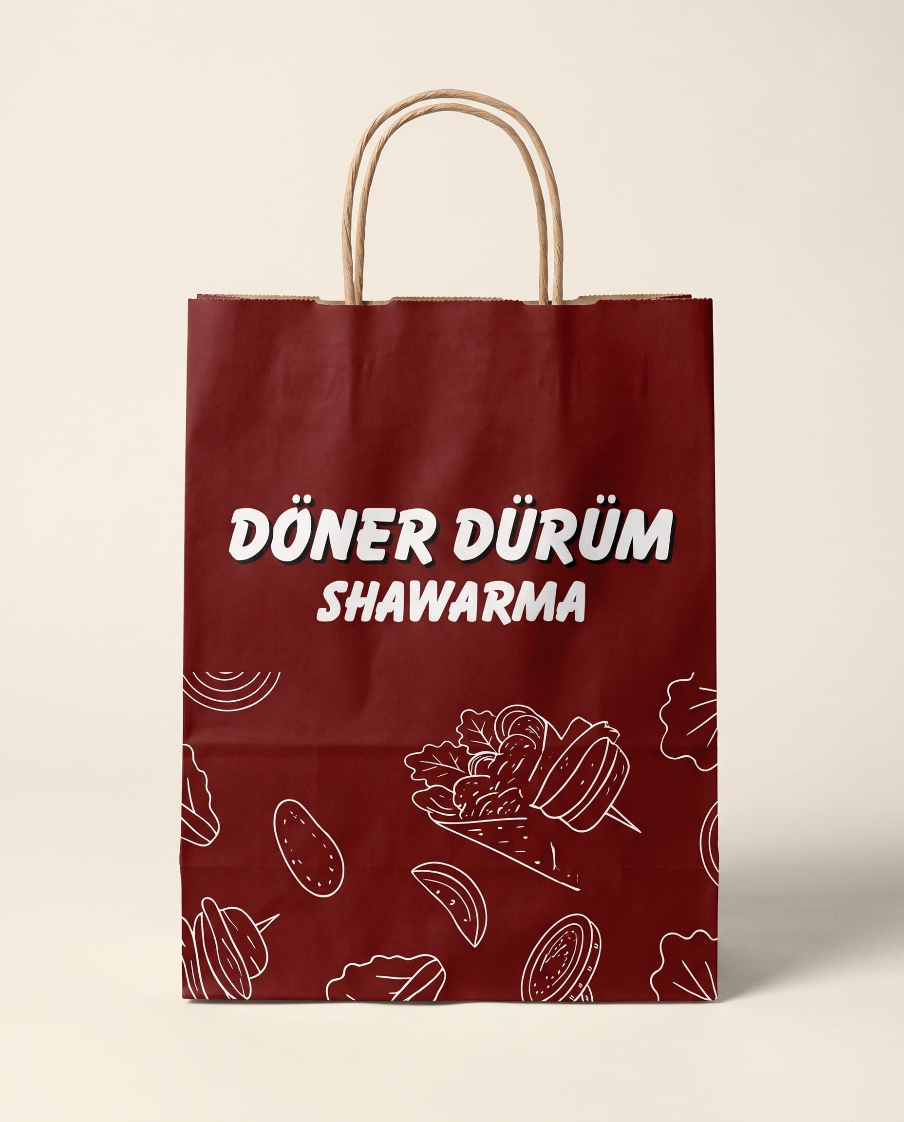
Takeaway bag
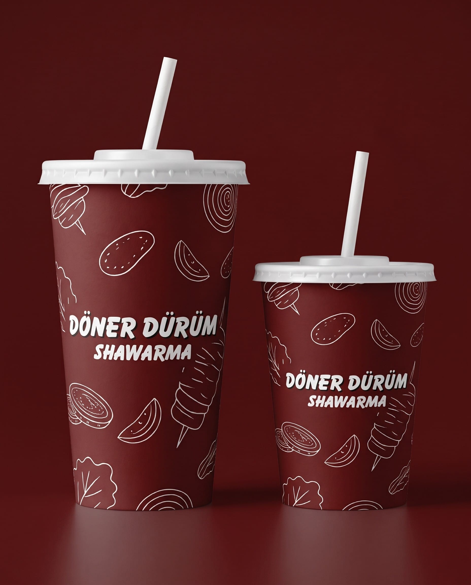
Cups
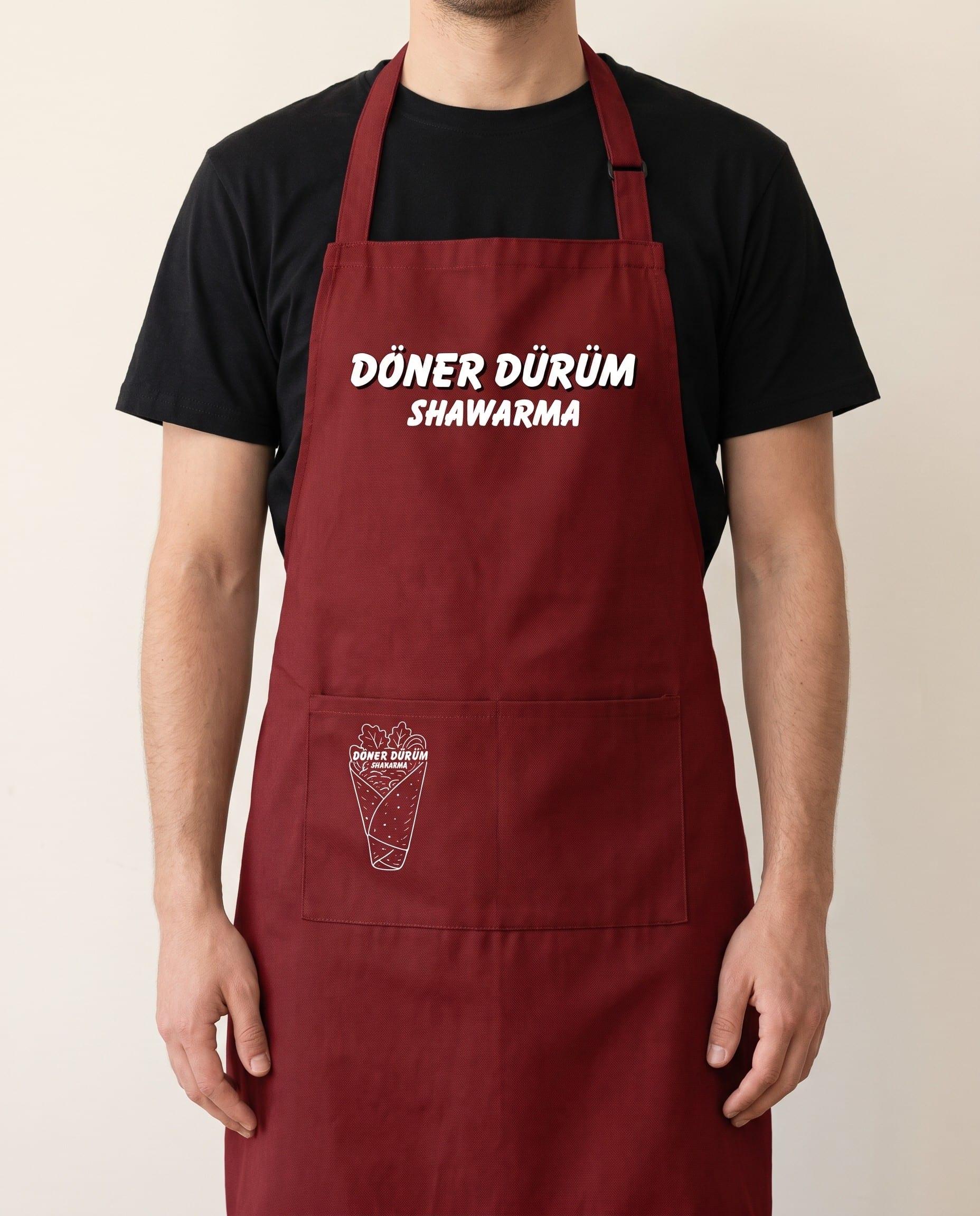
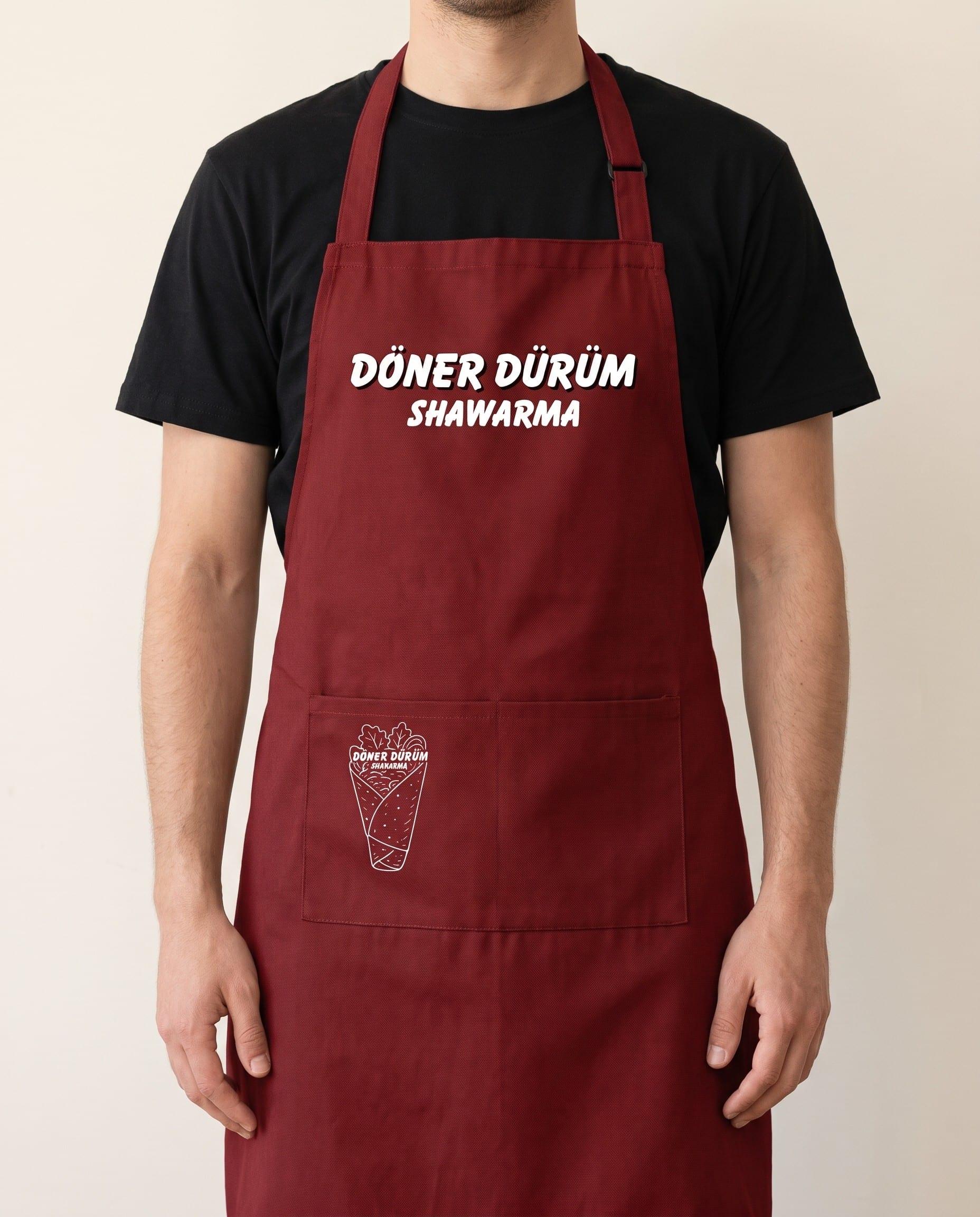
Crew apron
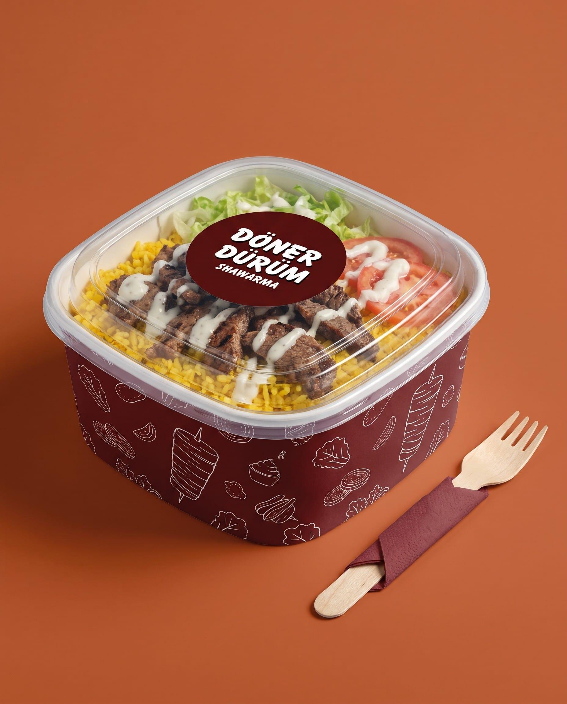
Rice bowl
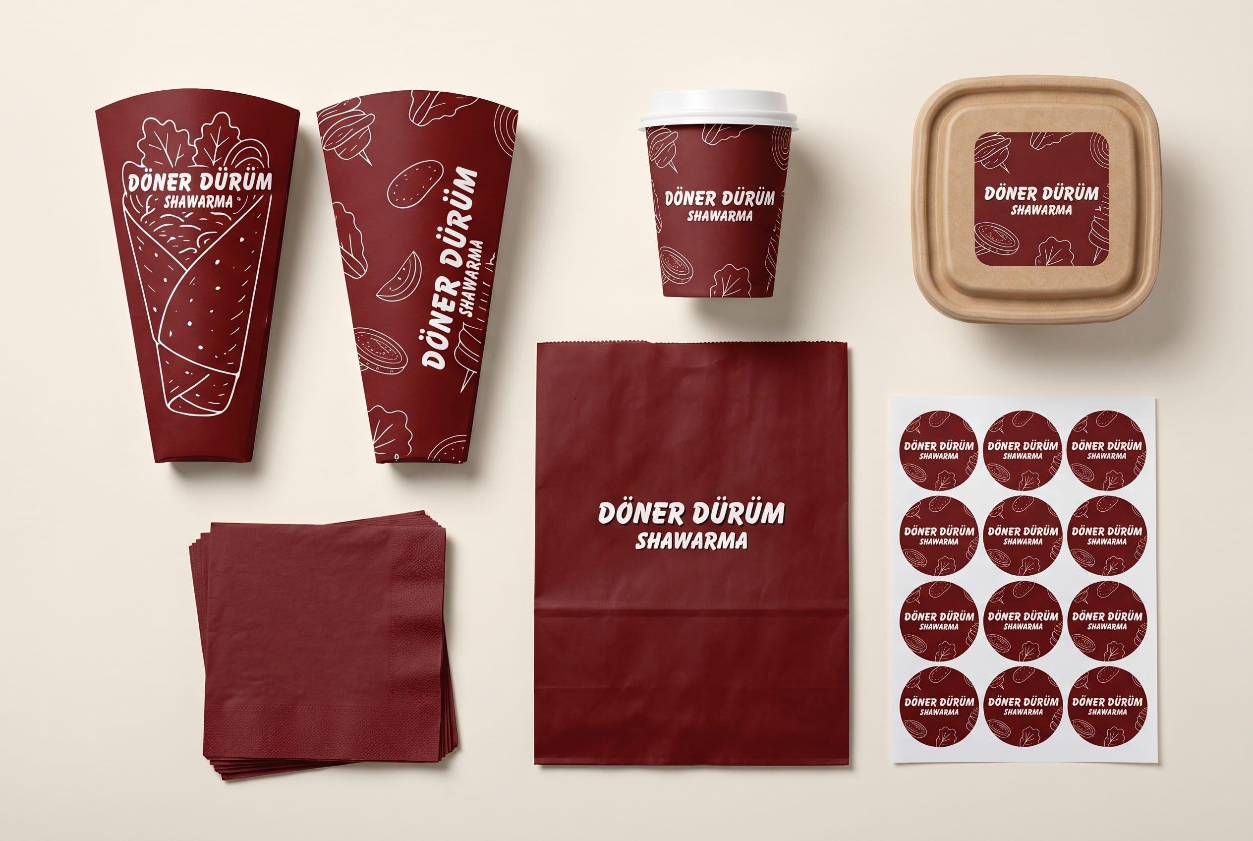
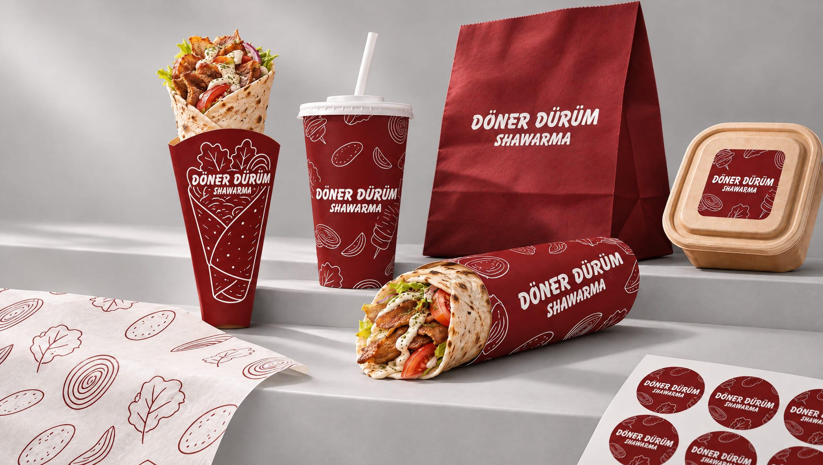
The full takeaway set
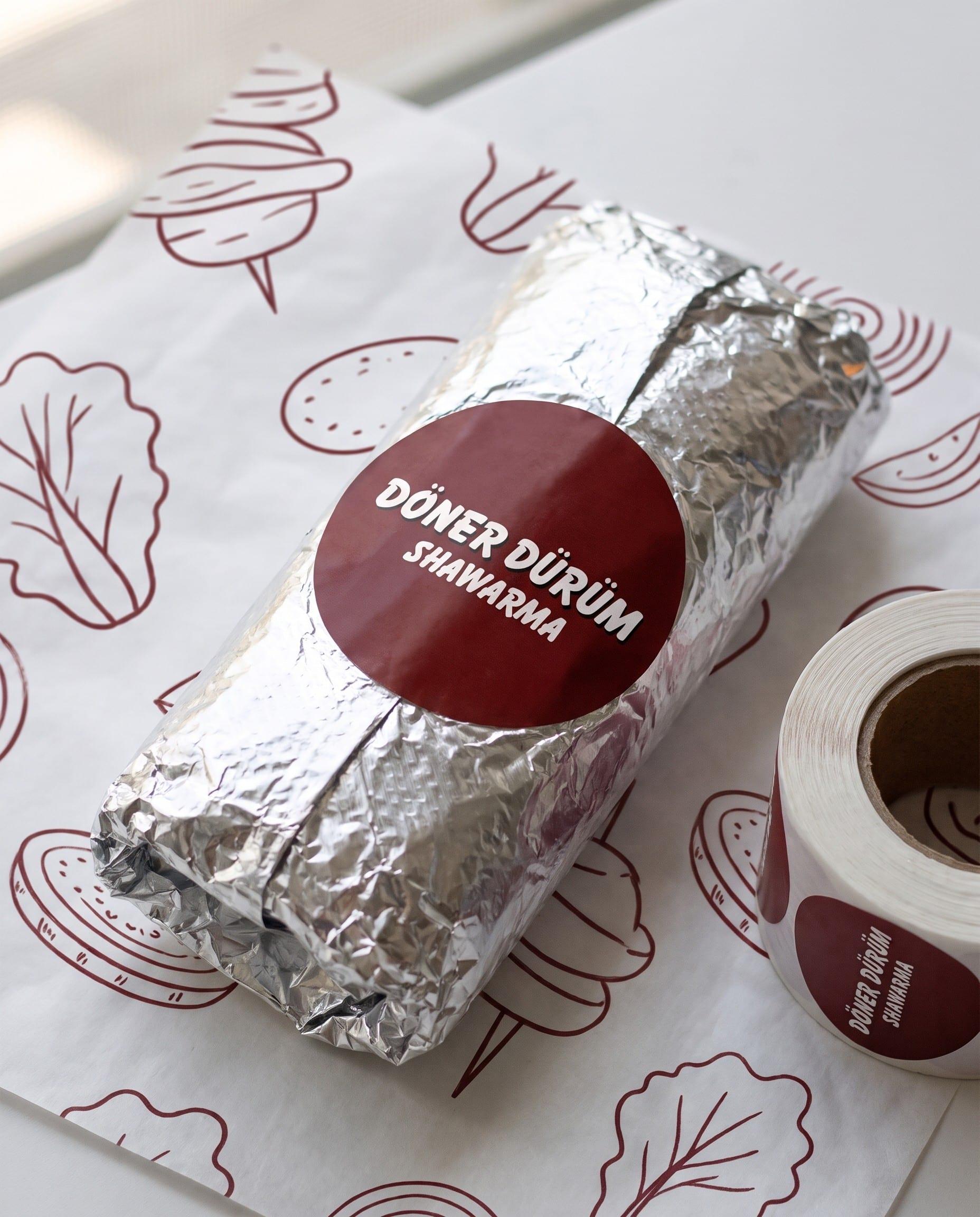
Sticker seal · greaseproof liner


Turkish-inspired · Homegrown
WRAPS
Beef Dürüm
₱00
Chicken Dürüm
₱00
Mixed Dürüm
₱00
Overload Dürüm
₱00
RICE
Beef Rice
₱00
Chicken Rice
₱00
Mixed Rice
₱00
EXTRAS
Extra meat
₱00
Extra cheese
₱00
Garlic sauce
₱00
Spicy sauce
₱00
DRINKS
Iced tea
₱00
Soda
₱00
Bottled water
₱00
This week
COMBO DEAL
Any wrap + drink
₱00
For catering services
Text or call 09436411888
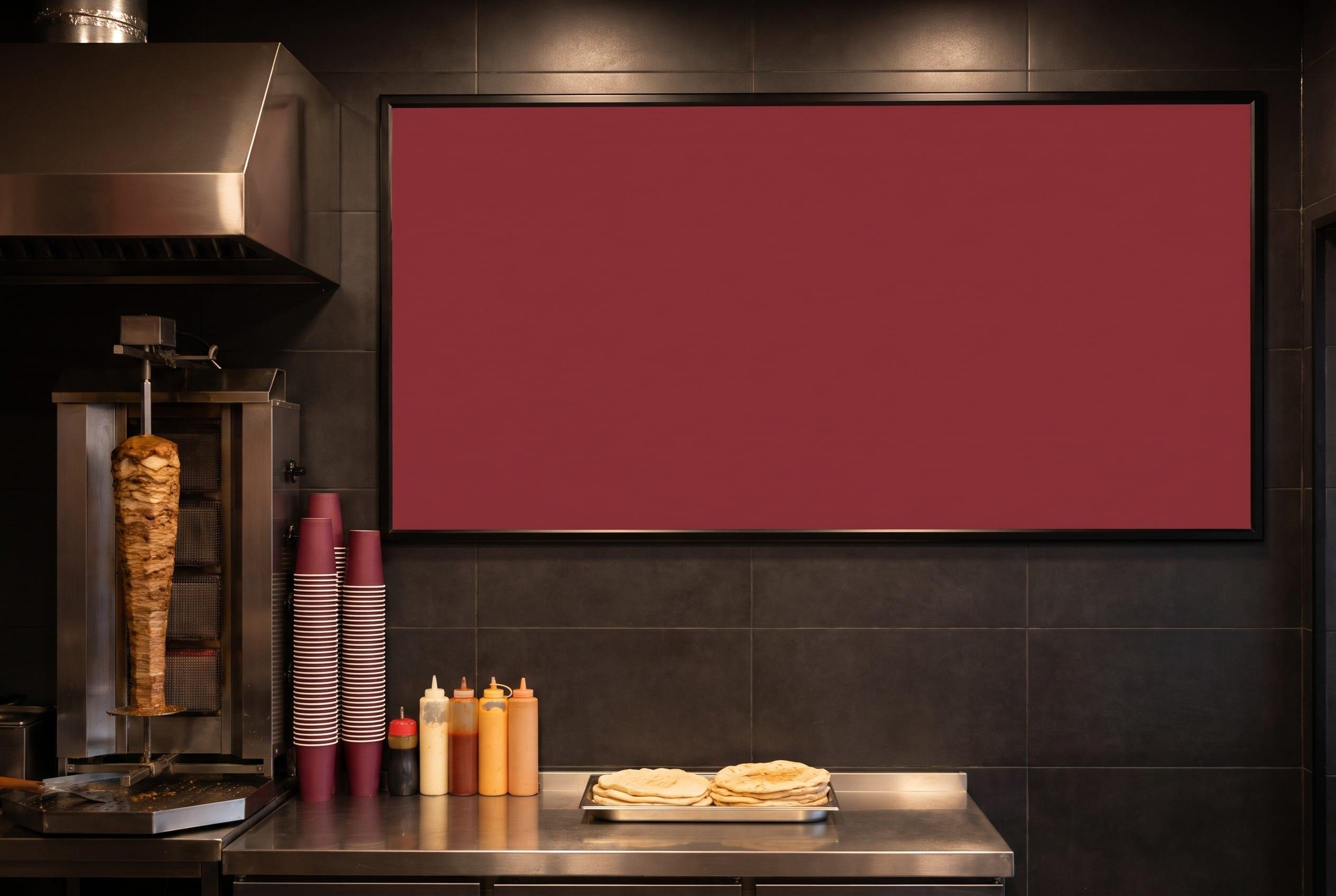
Menu board
Menu board
READ IT FROM THE QUEUE.
01 Lead with the wrap
The hero product gets the first position on the board.
02 Three groups, no more
Wraps, rice, extras. Find your order in one glance.
03 Prices that line up
Montserrat Bold, right-aligned, one size on every row.
04 One promo slot
Burnt orange is kept for the single offer of the week.


Turkish-inspired · Homegrown
WRAPS
Beef Dürüm
₱00
Chicken Dürüm
₱00
Mixed Dürüm
₱00
Overload Dürüm
₱00
RICE
Beef Rice
₱00
Chicken Rice
₱00
Mixed Rice
₱00
EXTRAS
Extra meat
₱00
Extra cheese
₱00
Garlic sauce
₱00
Spicy sauce
₱00
DRINKS
Iced tea
₱00
Soda
₱00
Bottled water
₱00
This week
COMBO DEAL
Any wrap + drink
₱00
For catering services
Text or call 09436411888
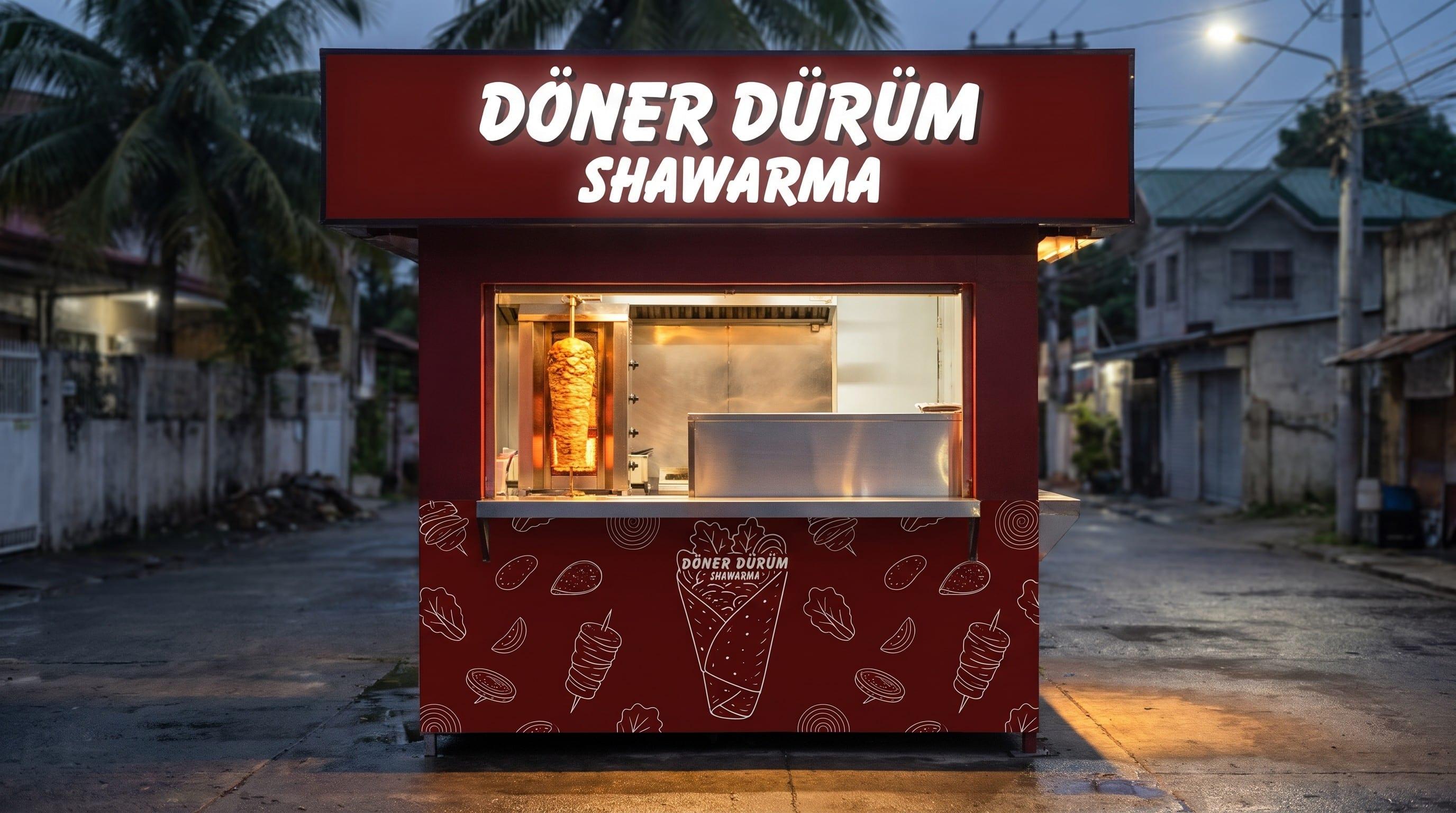
Stall fascia and front panel
Where the system applies
RECOGNISABLE WITHOUT THE LOGO.
Cups & bowls
Wrappers
Paper bags
Tarpaulins
Facebook posts
TikTok overlays
Promo cards
Menu boards
Receipts
Story templates
Stickers
If someone sees a cup or a post without the logo, they should still know it is Döner Dürüm from the colour and the line art alone.
Döner Dürüm Shawarma · Laguna, Philippines · Brand strengthening, packaging and menu
05 IN THE WILD
Out of the file,into the world.

06 ON THE FEED
Nine posts,planned as one.
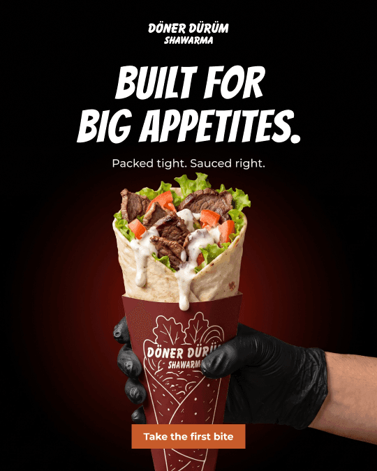
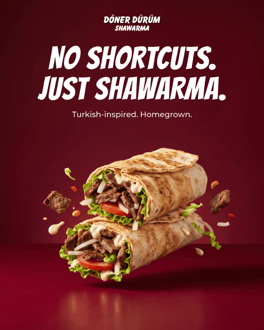
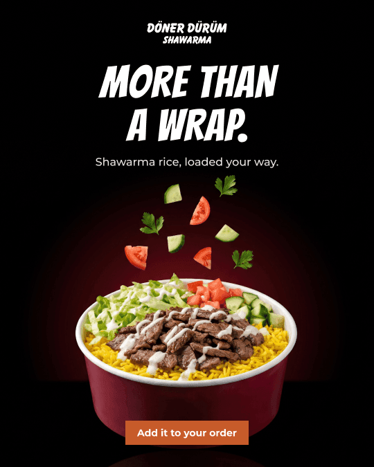
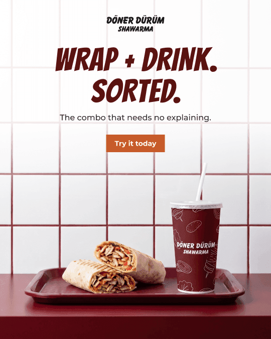
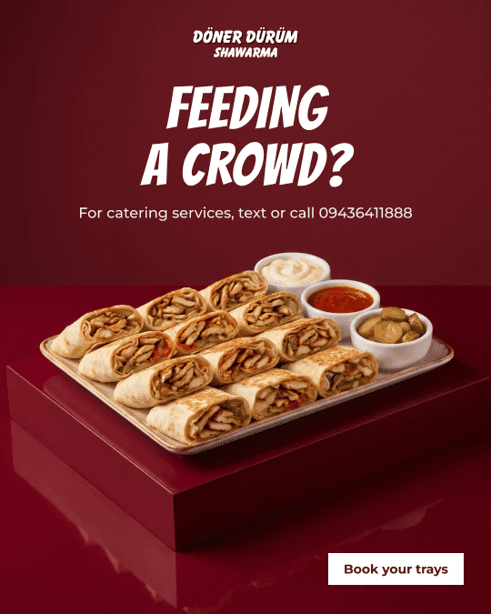
The grid was designed as a whole, so the profile reads as one brand at a glance. Each row has a job.
- 01Top row hooksThe line or look that earns the stop.
- 02Middle row builds trustThe product, the people and the proof.
- 03Bottom row asksOne clear thing to do next.
9:41
donerdurum
9
posts
followers
following
Döner Dürüm
Restaurant
Turkish-inspired. Homegrown.
FollowMessage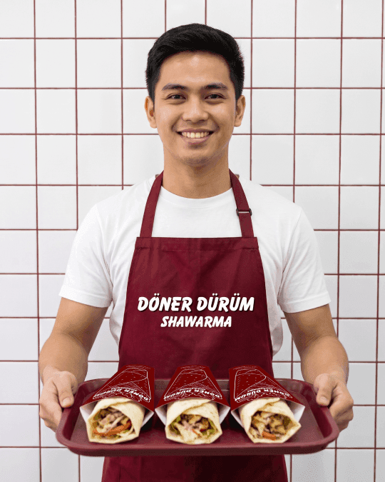
THE TAKEAWAY
A refresh works best when the regulars still recognise the place. Keep what people love, then make everything around it worth a photo.
WHAT SHIPPED
- Brand refresh
- · Pattern
- · Packaging
- · Menu board
- · Signage
- · Social grid