WEB UI/UX · 6 HOMEPAGES · MINING, EYE CARE, REAL ESTATE
Homepages that make people keep scrolling. Six brands, six moods, and one rule: the first screen has to earn the second.
- ROLE
- Web designer
- WHAT I DESIGNED
- Homepages, section systems, dev handoff
- TOOLS
- Figma, Webflow
- HOW TO VIEW
- Scroll inside the screen, or pick a site below

Each site auto-scrolls for a few seconds, then the next one slides in. Click any name to jump.
01 HOW I APPROACH A HOMEPAGE
Every homepage answers three questions, in this order.
What is this, and is it for me?
The first screen names who it is for and what they get. If they have to scroll to find out, we already lost them.
Why should I believe you?
Proof sits right under the fold: faces, numbers, logos, maps. Whatever this audience trusts most goes first.
What do I do next?
One clear action, repeated at the moments the reader is ready for it. Never shouted.
02 THE BUILDS
Six brands.
Six moods.
Scroll on and the whole page takes on each brand’s colours. Every screen scrolls, so you can read the actual design, not a thumbnail of it.
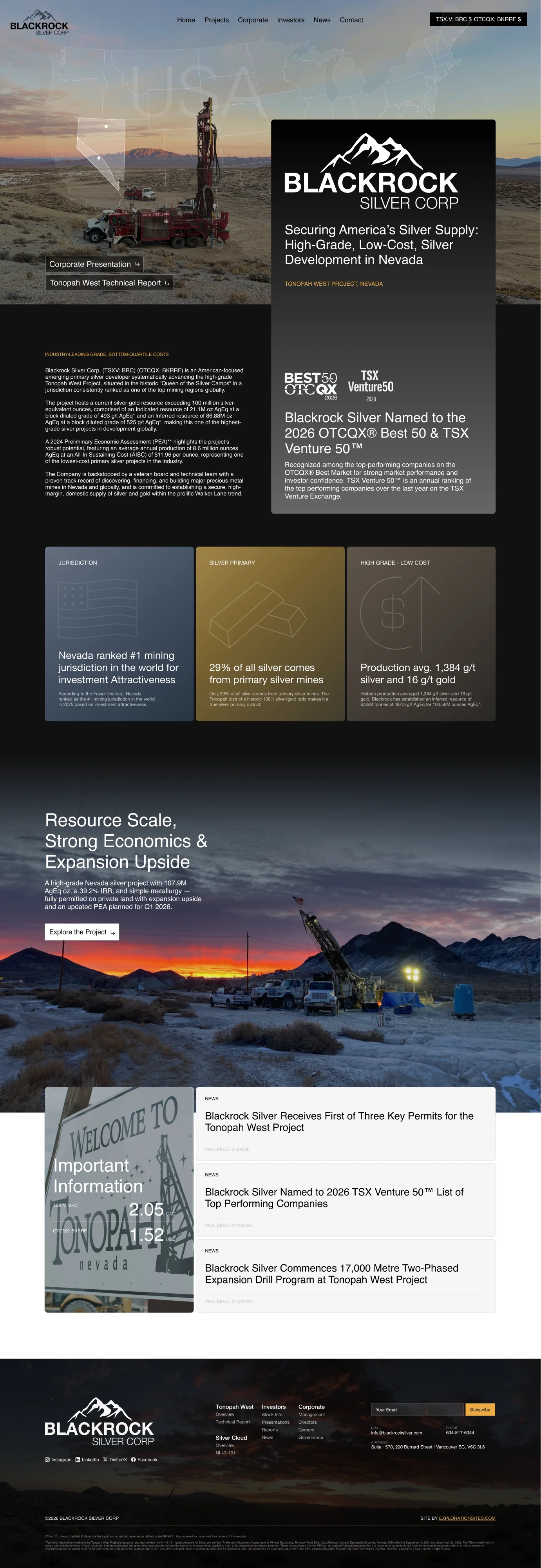
Blackrock Silver
Silver developer · Tonopah West, Nevada
THE BRIEF
They wanted dark. Properly dark, the kind that makes a silver story feel valuable.
THE CONCEPT
Night shots of the drill site carry the mood. White type does the talking, and a warm gold is saved for the few things investors should actually click.
UI/UX MOVES
- 01
Ticker in the header
TSX.V and OTCQX prices stay one glance away.
- 02
Numbers as headlines
Resource scale and grades read as big type before anyone opens a paragraph.
- 03
Awards as a press wall
Recognition and news stack together, so credibility builds as you scroll.
FAVOURITE SECTIONS
- #000000
- #111111
- #5C4D2E
- #ECAB45
- #FFFFFF
TYPE
Helvetica Neue
Dry Eye Council
Clinician council for dry eye brands
THE BRIEF
Sell a council of clinicians to companies launching dry eye products, without sounding like one more consultancy.
THE CONCEPT
A macro shot of an eye opens the page, so the subject lands in one glance. Deep navy keeps it clinical and calm, and Space Grotesk headlines give it a sharper, modern edge.
UI/UX MOVES
- 01
Lead with their worry
The hero talks about adoption in the clinic, the problem buyers already lose sleep over.
- 02
A path, not a pitch
How we work becomes four clear steps, from key question to clinical direction.
- 03
Faces as proof
Council members get a full section, because who is in the room is the product.
FAVOURITE SECTIONS
- #0B1738
- #3155AF
- #C7D0E8
- #F6F8FD
- #FFFFFF
TYPE
Space Grotesk + Inter
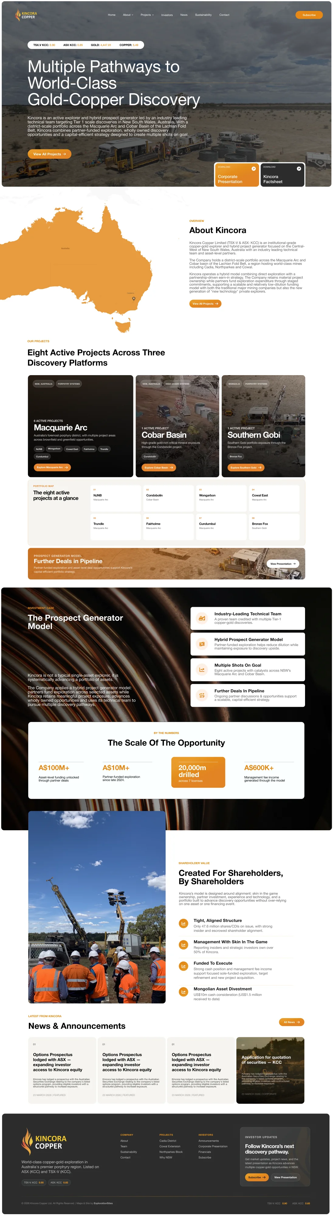
Kincora Copper
Copper-gold explorer · Australia
THE BRIEF
Eight active projects across three discovery platforms. Investors needed the whole picture, fast.
THE CONCEPT
A map of Australia does the first job: show the spread before anyone reads. Copper orange marks every action on a warm off-white that feels like a field report, not a spreadsheet.
UI/UX MOVES
- 01
Map first
Projects pinned on a map, so the portfolio reads as territory instead of a list.
- 02
Platforms as cards
Each discovery platform gets a photo card and its own way in.
- 03
Scale in one band
The opportunity numbers sit together in one orange band, easy to quote.
FAVOURITE SECTIONS
- #E48816
- #111111
- #666666
- #F5F4F0
- #FFFFFF
TYPE
Helvetica Neue

Vanguard Optometric Society
Leadership network of optometrists
THE BRIEF
Show industry partners why a room full of leading optometrists is worth their time and budget.
THE CONCEPT
Fraunces italics give the headlines a warm, editorial voice. Deep green and mint feel established and calm, like a society that has been around for decades.
UI/UX MOVES
- 01
One italic word
Each headline leans on a single italic word, so the point lands while skimming.
- 02
Forums as offers
Advisory forums read like something a partner can picture buying.
- 03
Advisors up front
A portrait wall shows who is in the room before the pitch starts.
FAVOURITE SECTIONS
- #0B2926
- #0F332E
- #46645E
- #C8E4DF
- #F4F7F5
TYPE
Fraunces + DM Sans

AQQIRE
Commercial real estate hub
THE BRIEF
A marketplace has to feel trustworthy on the first load, or nobody searches.
THE CONCEPT
Search sits right in the hero, with logos and big numbers just under it. Navy and clean blues borrow the calm of a finance product, so listings feel safe to explore.
UI/UX MOVES
- 01
Search in the hero
The main job is right there, no scrolling needed.
- 02
Trust in the second fold
Logos and headline numbers answer “is this legit?” fast.
- 03
Browse by type
Property types as clear tiles for buyers who already know what they want.
FAVOURITE SECTIONS
- #062239
- #0D1626
- #1E4B96
- #EEF3F9
- #FFFFFF
TYPE
Montserrat + Open Sans
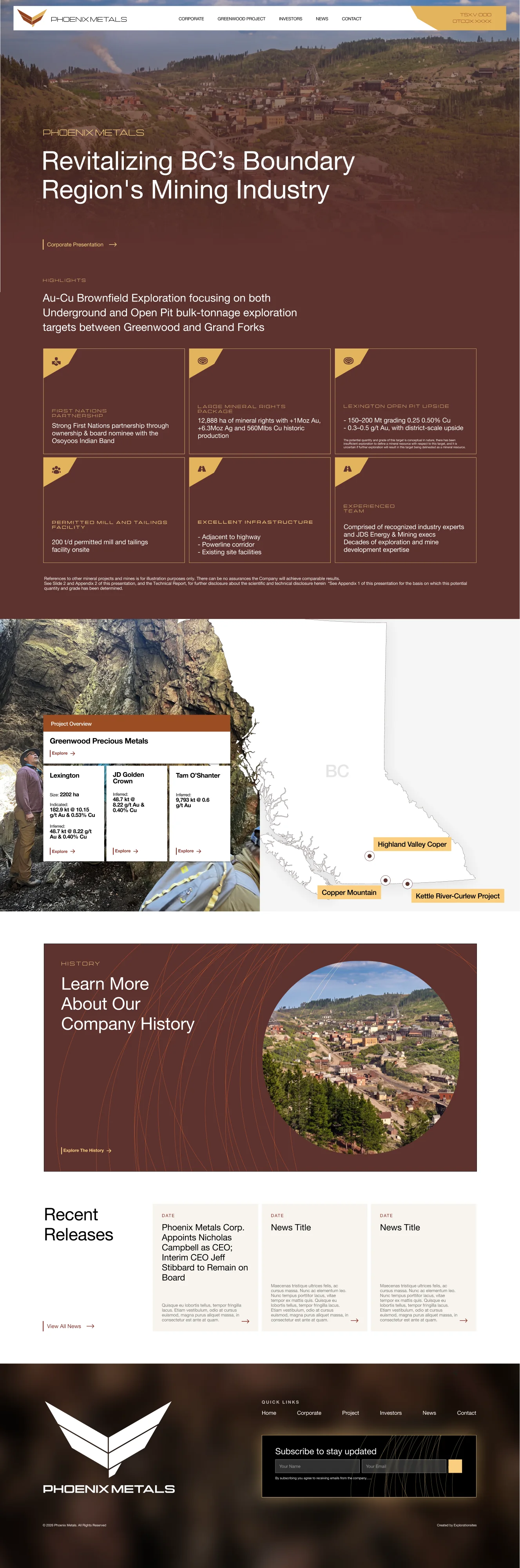
Phoenix Metals
Boundary region, British Columbia
THE BRIEF
Tell a comeback story for a historic mining region and make it feel current.
THE CONCEPT
Warm burgundy and gold nod to the region’s heritage. A wide, extended display face gives headlines presence, and a map of the Boundary region shows where the work happens.
UI/UX MOVES
- 01
Heritage palette
Burgundy and gold feel rooted without feeling retro.
- 02
Map as story
The region map grounds every project in a real place.
- 03
News within reach
Recent releases live on the homepage for investors who check in often.
FAVOURITE SECTIONS
- #5E332F
- #FACE7F
- #F7F4EE
- #000000
- #FFFFFF
TYPE
Manifold Extd + Helvetica Neue